Harvard Business Review’s self-styled "dataviz geek" brings HEC Paris latest tools to visually transform data
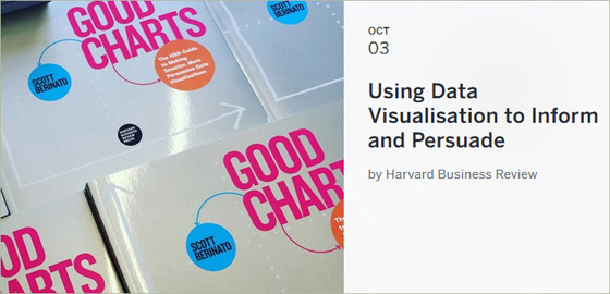
Today, in America, Data is being called “the oil of the future”. But like brute oil, it has no value until it is processed. So, how do we use data to create good charts? That was the question addressed by Harvard Business Review’s Senior Editor, Scott Berinato, to students and staff on the HEC Paris campus on October 3. In the “Using Data Visualisation to Inform and Persuade” Seminar, presided by HEC Paris Professor Michael Segalla, Berinato described his research on dataviz, a new language for thinking visually and drawing effective charts “through a process of talking, sketching and prototyping”.

A good visualization can communicate the nature and potential impact of information and ideas more powerfully than any other form of communication (According to whom? Berinato?). The good news, said Berinato, drawing from his just-published book Good Charts, is that a new generation of tools and massive amounts of available data are making it easy for anyone - not just data scientists and professional designers - to create visualizations that communicate ideas far more effectively than generic spreadsheet charts ever could. However, the biggest problem today is that many companies don’t use data the right way, while data charts are often hard to read and lack clarity.
So, what does the future of data visualisation look like? Today, there is still a big confusion between data analytics and artificial intelligence. “I believe that in the next three years, we’re going to have a real revolution on how we use data. In three years, anything that can be connected will be connected. We really need to start understanding data, and understanding it is all about visualization”, Berinato concluded.
Complementing the visiting editor’s vision, professor Segalla, underlined the importance of the three “S” mantra. These, claimed the professor of Management and Human Resources, can help anyone create the perfect chart: small - the chart needs to be readable on a small screen; simple - it must be unambiguous and easy to understand quickly and finally; smart - it needs to drive the decision to buy.
Also attending the talk were Catalin Ciobanu, Senior Director Data & Analytics at Carlson Wagonlit Travel, Thomas X. Scott, Communication Manager at Amazon and Uwe Diegel, CEO of HealthWorks France / MedActiv. They all acted as panelists during the event and shared their tips on creating efficient charts.